It takes at least one full week for a team to build an HTML email template, while 319.6 billion emails are sent on a daily basis. When working in such volumes, it is natural to run out of ideas when it comes to designing your messages. Email designs are evolving at a faster rate after 2015 as mailbox service providers have finally started to update support for enhancements like AMP. Still, aesthetics remain one of the most decisive factors for the success of your outreach campaigns, and today, we are going to have a look at the monochromatic design.
Monochromatic color palettes use one base color and change value (brightness), tint (whitnesss), shade (darkness), and tone (greyness) to create eye-soothing variations. As an email developer, this makes your job easier since you don’t need to choose from a huge array of hues. To inspire your next email design inspiration, I am bringing up eight irresistible examples of using monochromes in emails:
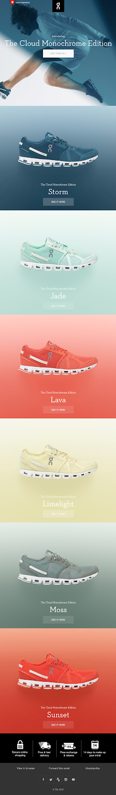
#1 On
Monochromes are known for projecting simplicity-inspired sophistication, and On used it perfectly to give their brand a premium appeal. Contrary to the first impressions, monochromatic designs provide email developers with great freedom to experiment with aesthetics. In the below example, they have used layering and texturing to display their shoes. Also, they have put contrasting colors for displaying different shoes above each other to give a nice cohesive look:
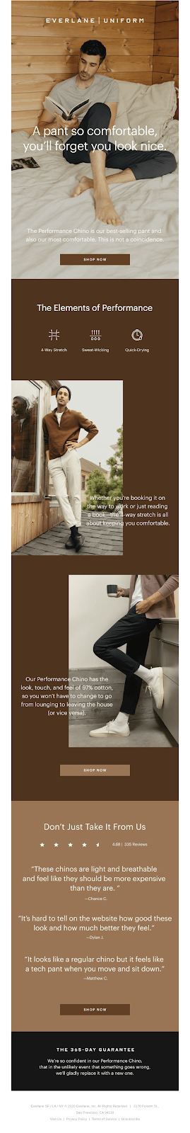
#2 Everlane
Everlane has excellently managed to give their image depth, ambiance, and visual appeal in this example. They also have leveraged patterns to display other apparel and to separate the elements inside the email body. If your products come in a variety of colors, using such tactics can be a game-changer. The minimalist design language coupled with monochromes is arguably the biggest sensation in the design world at the moment. Have a closer look:
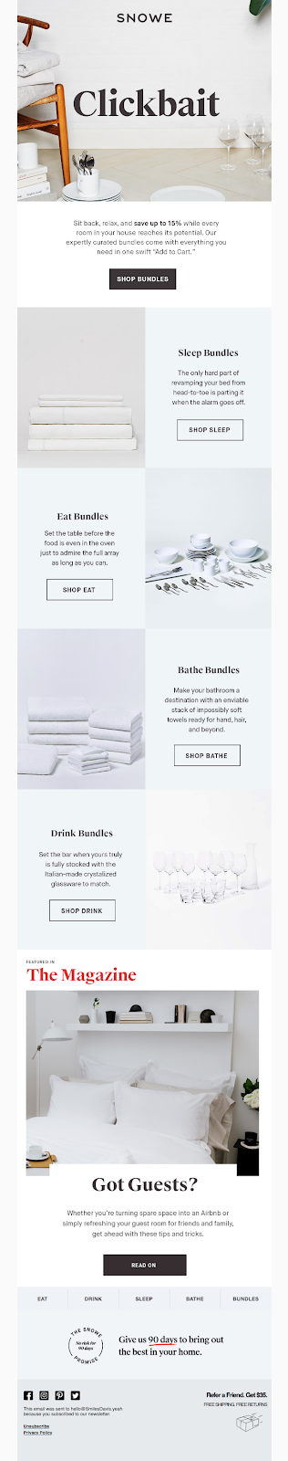
#3 Snowe
Wondering which design will suit your newsletter template? This email newsletter from Snowe just dropped the clue: Monochromatic hues. This message looks very sorted, and despite being a newsletter with multiple agendas hovering around, you will never find it to be messy or cluttered. This design can have extremely positive effects on your readers as they won’t get overwhelmed with too many details to read:
#4 Dims
Brown is an earth color, and thus, it is a great choice if you are willing to instill an emotional impact with your messages. Dims aced this aspect exceptionally well as they blended their copy focused on collaboration with a beautiful image that used brown as the base color. You can use this trick for almost any brand or product as long as you keep the color theory in your mind while designing.
 (
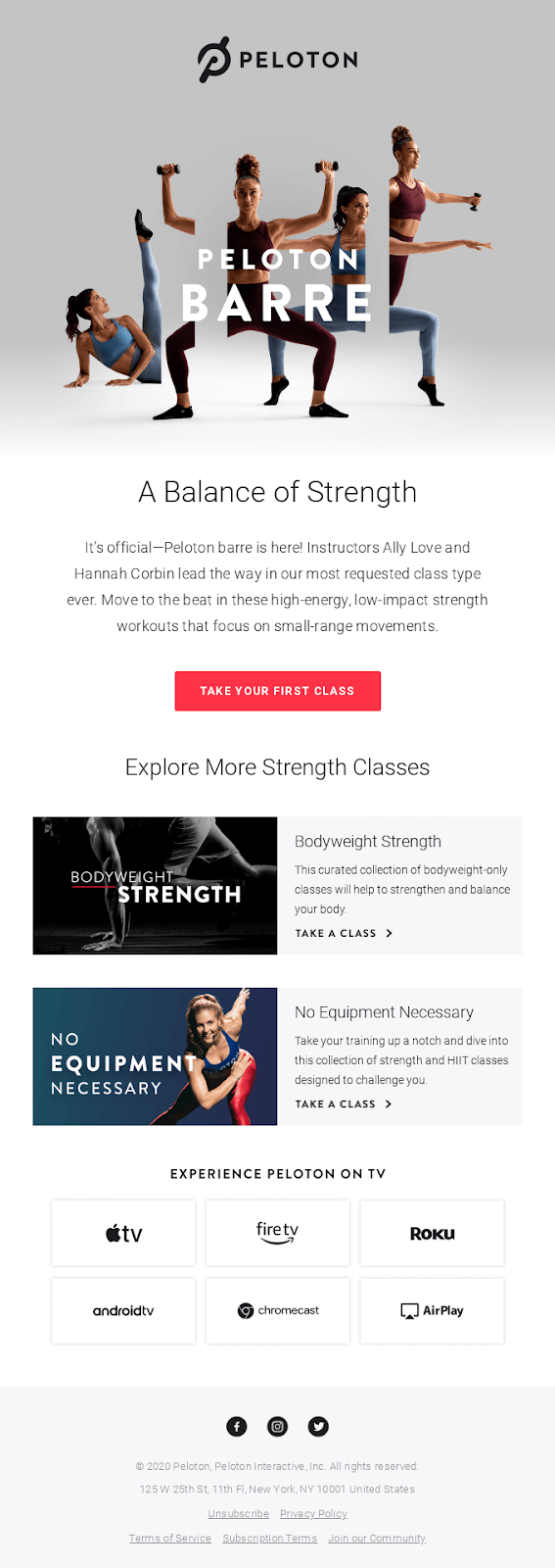
(#5 Peloton
This example from Peloton displays how you can use contrasting tones inside monochrome designs. They used blue and burgundy colors for the model’s clothing and placed them against a grey texture to give a solid appeal to their message. Remarkably, the carrot color CTA is well separated from its surroundings, and this could be a great idea to improve your click-thru rate.
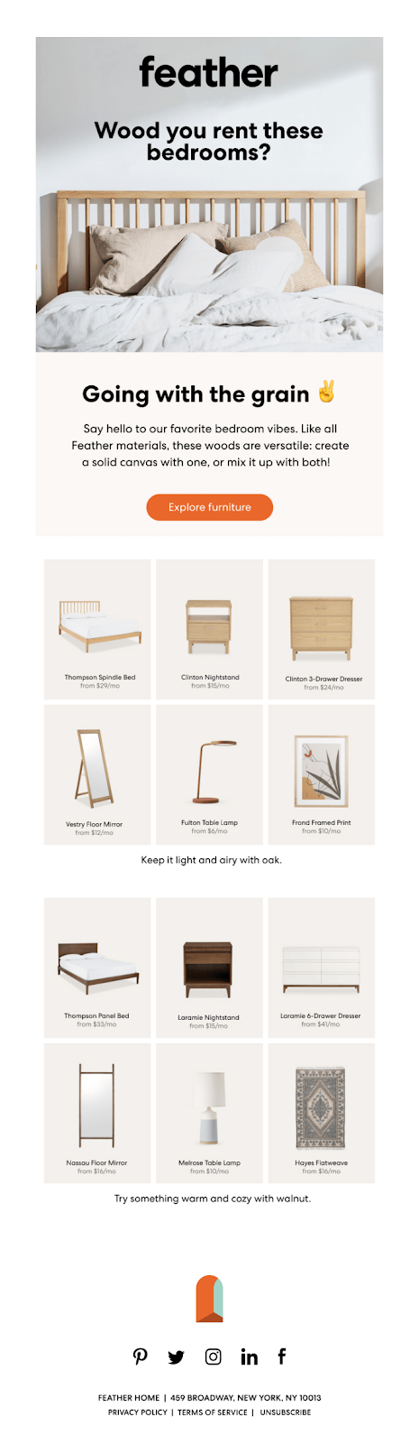
#6 Feather
Here’s another hygge heavy email design coming from Feather. They used the cream color to alleviate their product’s ability to provide comfort, while wooden items look absolutely beautiful in cream-based backgrounds. The grid layout also adds to the overall feeling of uniformity despite displaying furniture of all shapes and sizes. If you have different products under the same brand, you can also use contrasting colors to make them appear more connected with your brand.
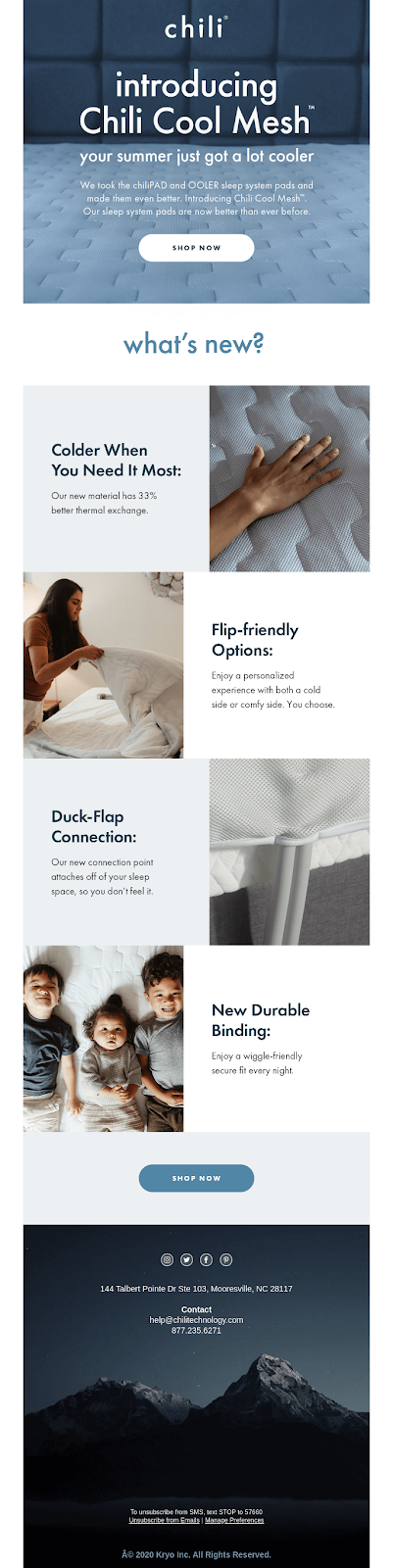
#7 Chili Sleep
Among all monochromatic color palettes, blue color offers the maximum variations. Chili Sleep has used both the bold and toned variations of blue to create this email wrapped in an aesthetic feast. It resonates with their copy claiming to make the reader’s summer cooler. You can also find that this email smartly uses tints and shaded to communicate temperature both in the hero image and in the footer. You can also draw inspiration for displaying warmth or coziness with relevant base colors:
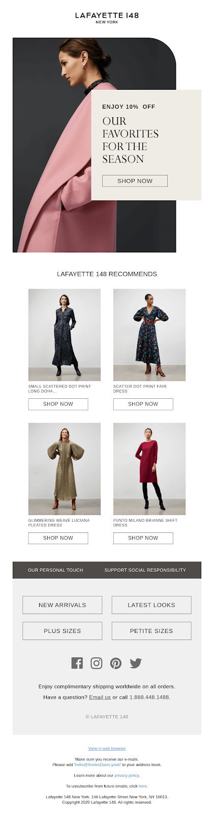
#8 Lafayette 148
Here’s a perfect example of using contrast to draw attention and yet give a cohesive look coming from Lafayette 148. All five models are wearing clothes that contrast with the linen backdrop while it unifies all five of them. This is a time tested tactic since many brands use this method to give a homogeneous appeal to their Instagram profile where all posts are distributed in the square grid. If your products don’t contrast with each other, you can use this method to pack them inside an email without distorting its visual feel, just like in this example:
Summing Up
Monochrome email designs can be classy, bold, and even rigorous depending on the base color you select, but I would recommend one key observation I made: Keep the color wheel in the loop. When you emphasize a single color, neglecting its emotional impacts isn’t a great idea. Choose your base colors wisely, and leverage tints, shades, and tones for reinforcing the emotional value of your copy. Follow this mantra, and your monochrome email designs will never fail to amuse your subscribers. I hope these irresistibly inspiring designs benefit your next email campaign.
Author Bio: Kevin George is the head of marketing at Email Uplers, that specializes in crafting Professional Email Templates, PSD to Email conversion, and Mailchimp Templates. Kevin loves gadgets, bikes & jazz, and he breathes email marketing. He enjoys sharing his insights and thoughts on email marketing best practices on email marketing blog.