The outcome
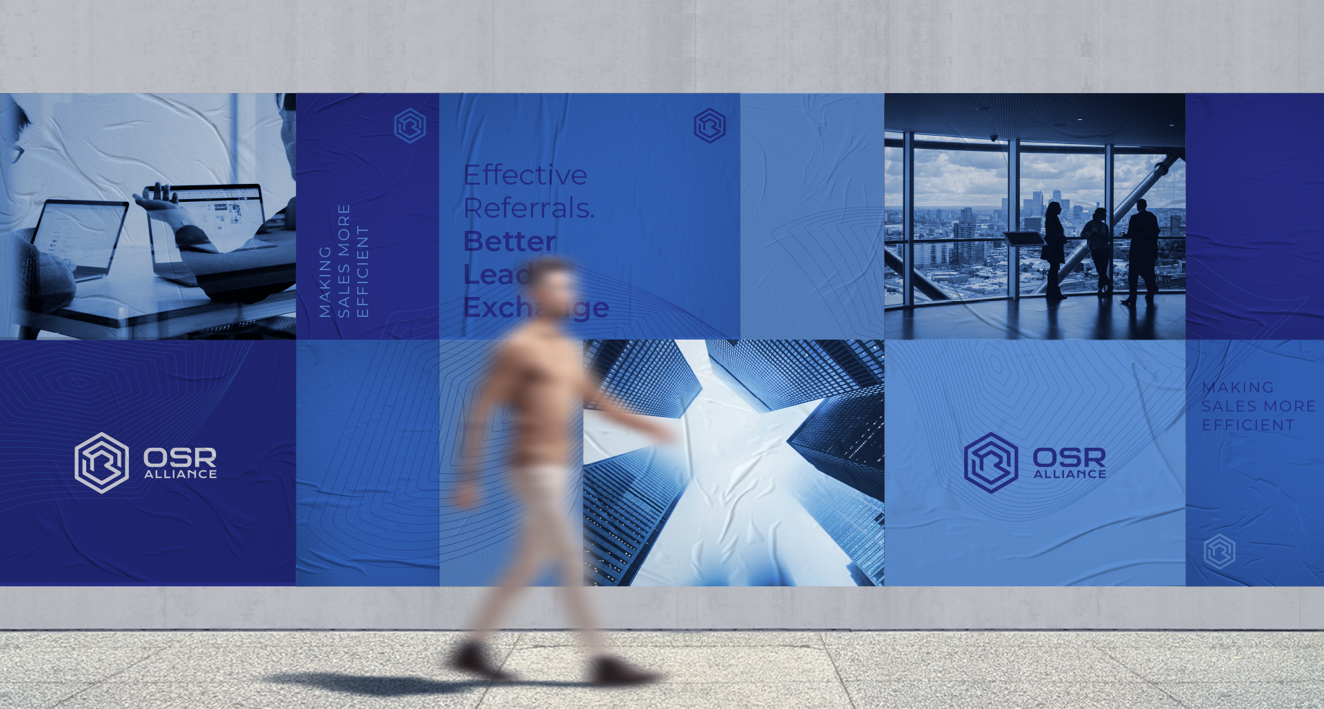
The brand has been very well received both by the client as well as their prospect users. Given the geometrical nature of the mark, we expect it will age very well and grow with OSR’s offers and user base.
CRMs are dreaded across industries for good reason. They are cumbersome, tedious to navigate and often times, ineffective. OSR Alliance value comes in the form of an easily manageable platform that connects you, the salesperson, to a network of similar professionals who collaborate their expertise and connections for effective lead sharing and increased opportunity for closing.

A completely new company with a brilliant concept to drive interest and adoption, OSR alliance needed an expression of their brand that would communicate the bleeding edge nature of their solution in an elegant and conceptual mark. Fahrenheit's solution for the challenge at hand was to create a geometrical representation of the company's initials, embedded inside of one another, spelling out OSR in that order.

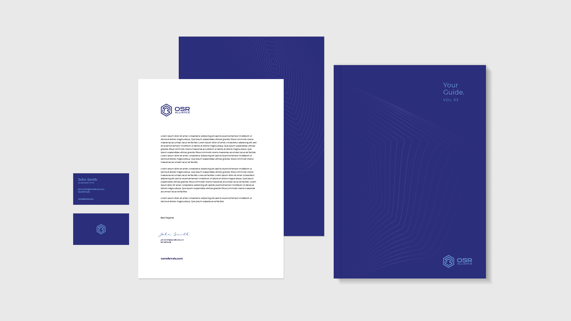
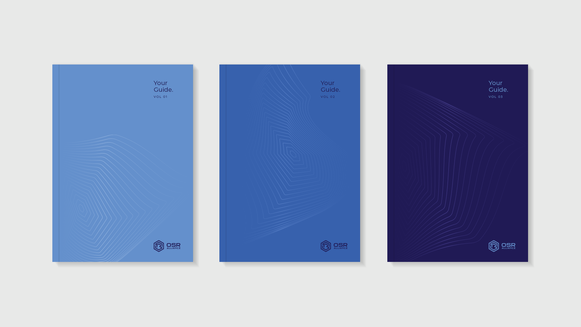
Fahrenheit's solution for the challenge at hand was to create a geometrical representation of the company's initials, embedded inside of one another, spelling out OSR in that order. We chose colors of trust and establishment to support the newly created mark. Blue over blue offered the perfect backdrop for the companies' communications and seemed like the right choice for this particular application. Lots of negative space leave the brand elements breathing freely, offering an overall air of sophistication and class.




The brand has been very well received both by the client as well as their prospect users. Given the geometrical nature of the mark, we expect it will age very well and grow with OSR’s offers and user base.
