Skip to content

PROJECT OVERVIEW

  • Website Re-design
  • Development

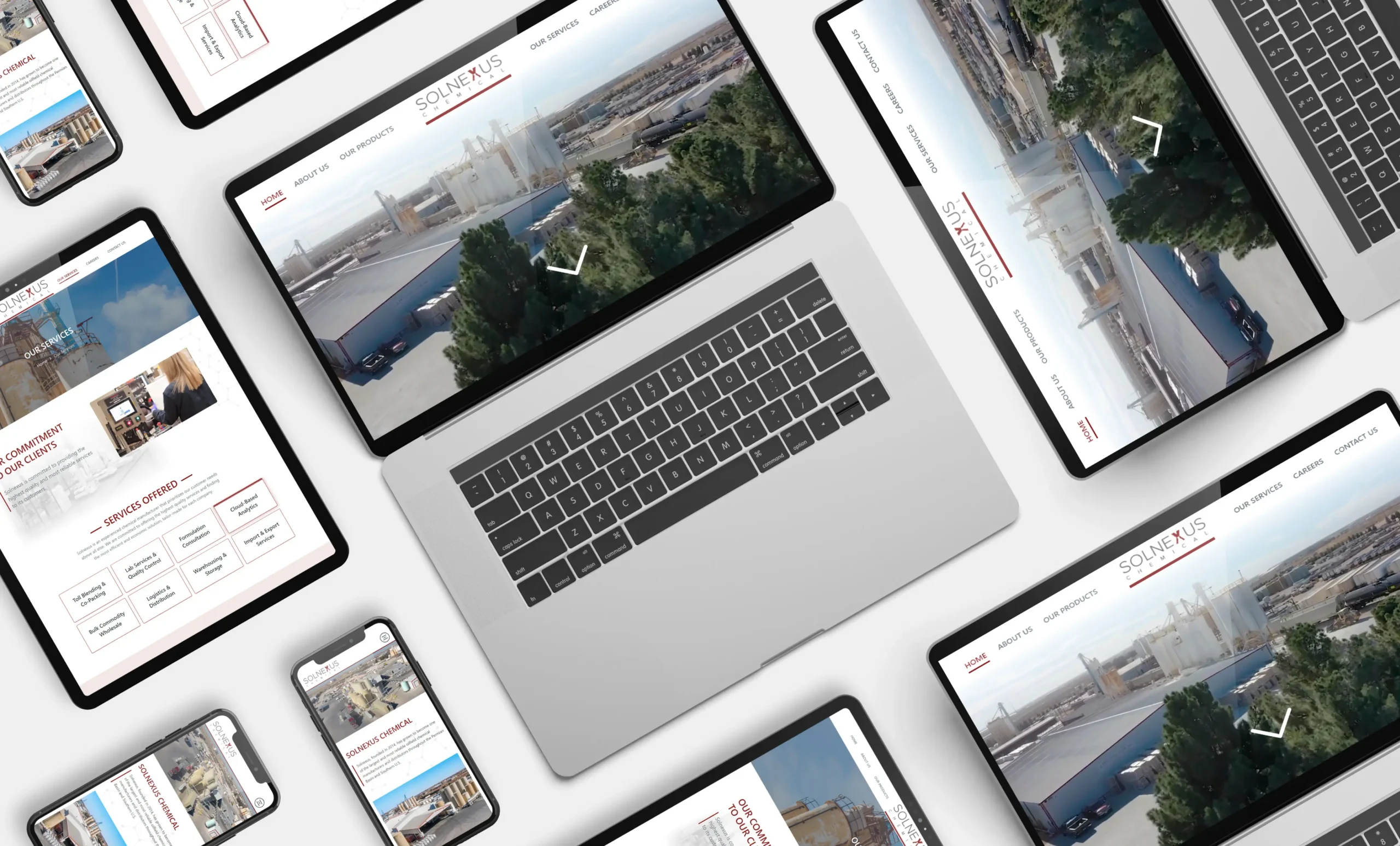
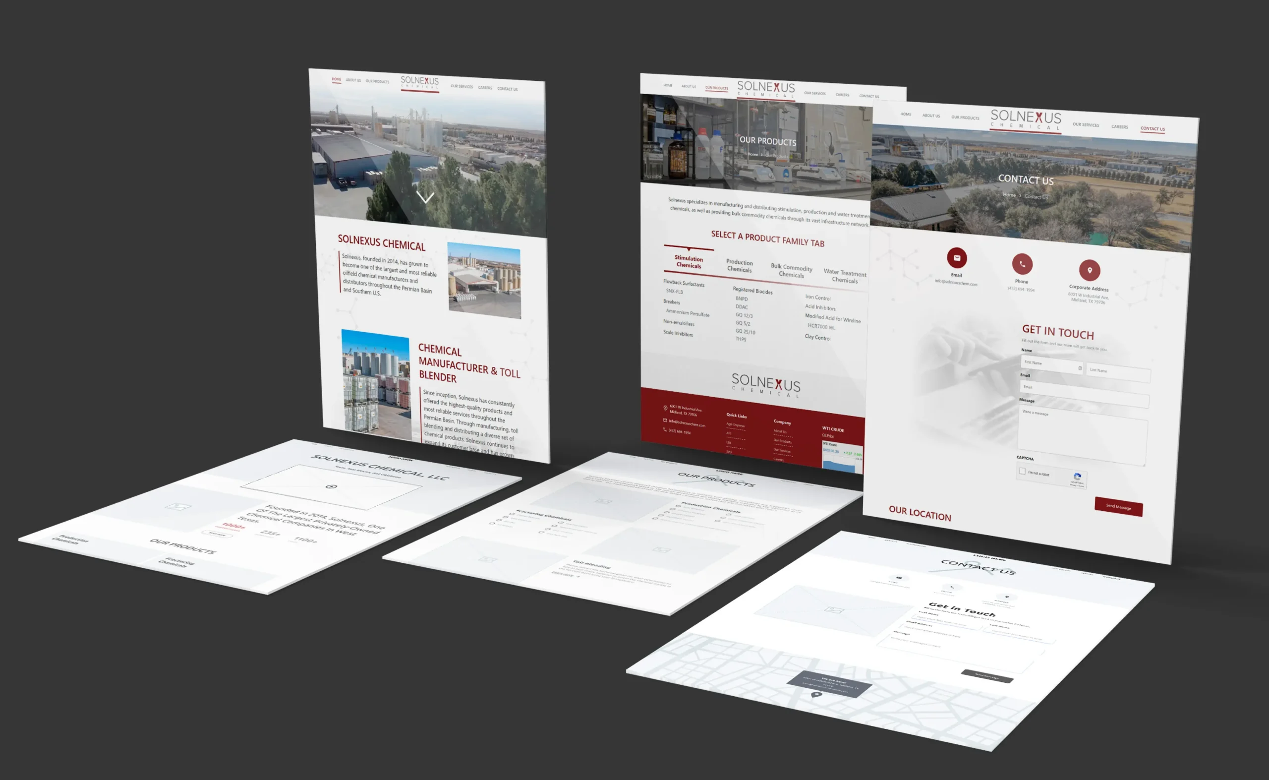
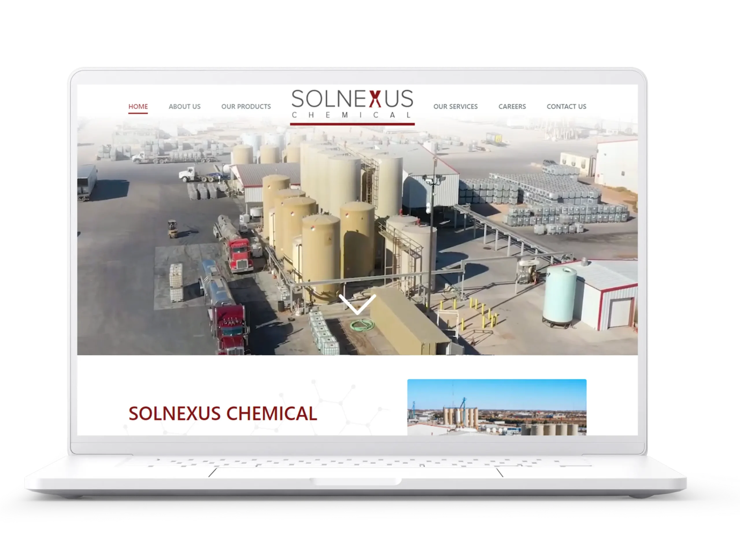
Solnexus Chemical, a choice chemical processor in the Permian Basin needed a new website to outperform an older, sluggish one, allowing for greater performance on SEO. Starting with user experience in mind, Fahrenheit Marketing designed, developed, and launched Solnexuschemical.com

Simple and sleek, it meets the desire for large format video and pics without losing load speed. A foundation for future sales pages, it was designed for growth. Using WordPress, this website will continue to serve the evolving needs of Solnexus for years to come.

Challenges

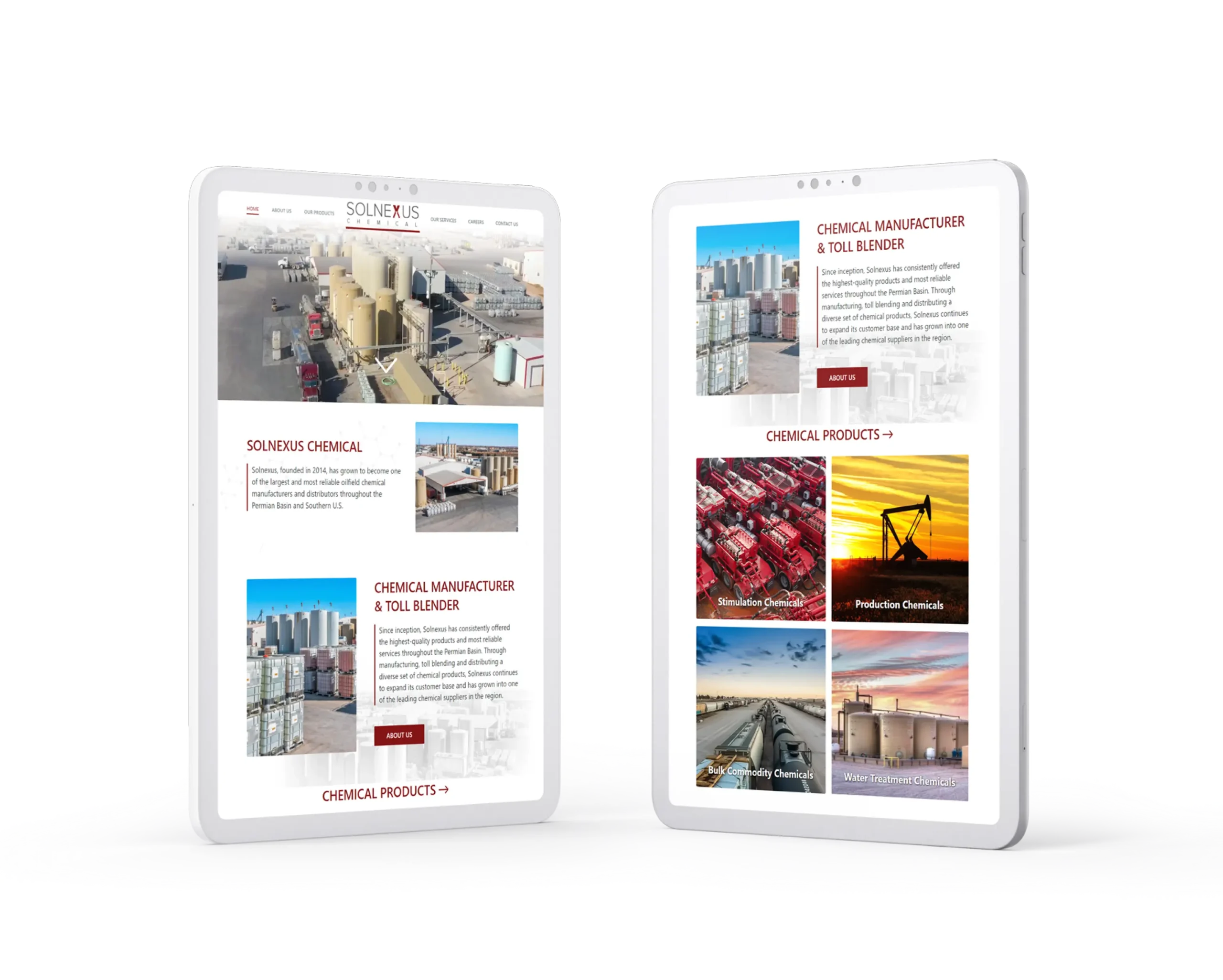
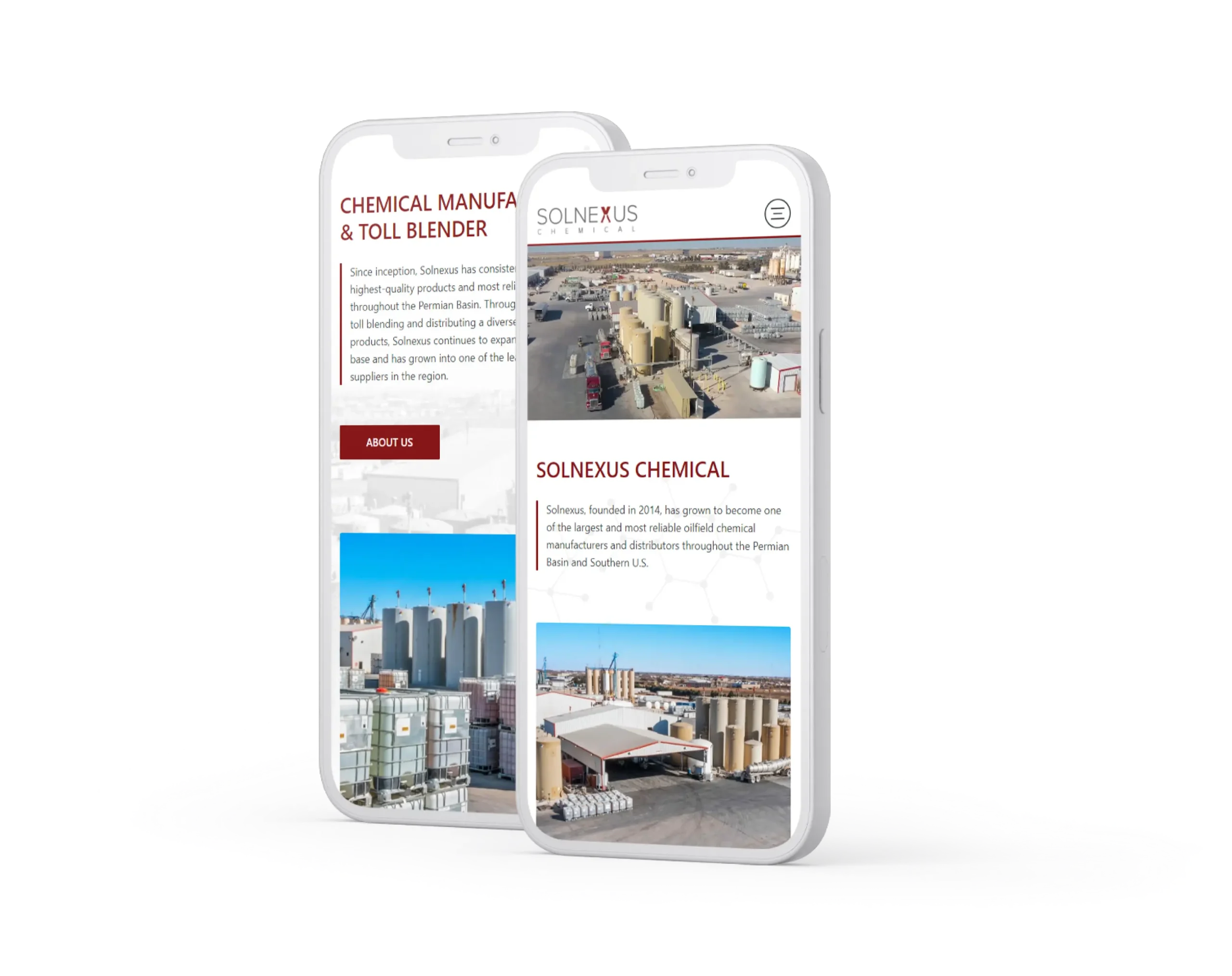
  • The former Solnexus site was built in a different era of web design and was not responsive to mobile and tablet views.
  • The company desired a new look that embraced the wide open spaces of West Texas and yet felt as cozy as an Erlenmeyer flask.

Goals

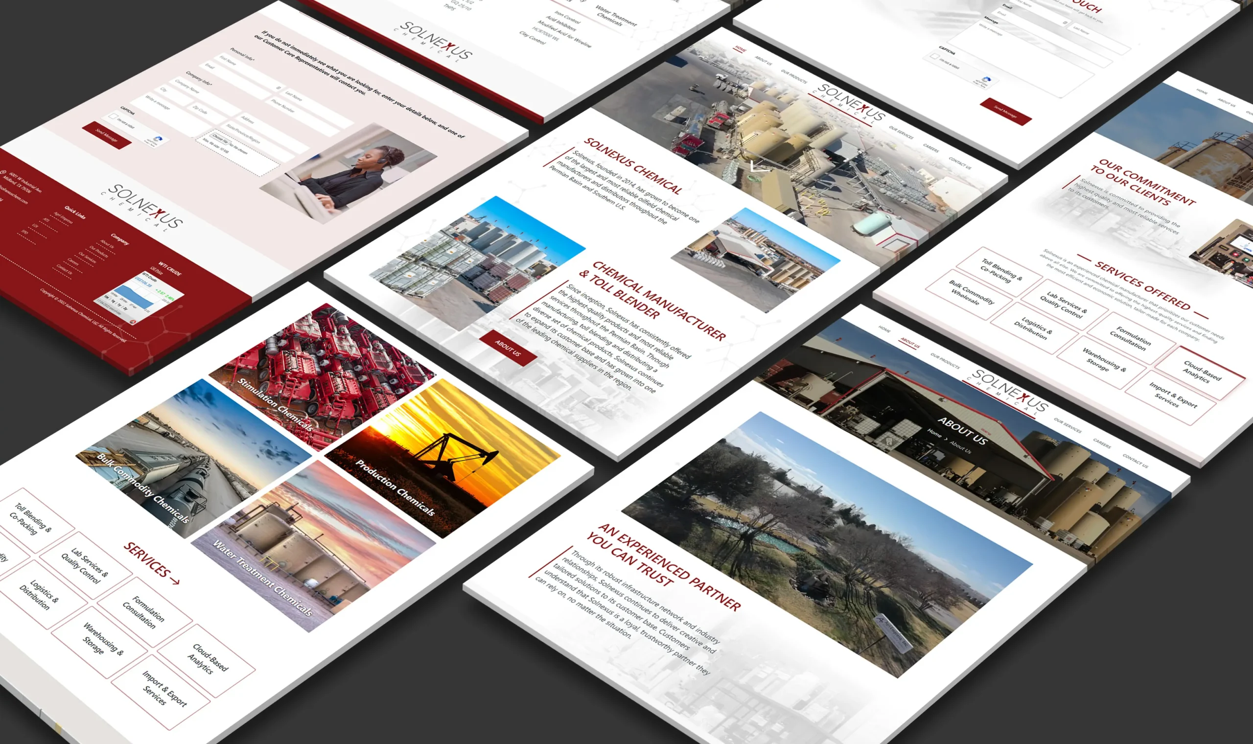
  • To create visually appealing imagery that told a story using hundreds of identical storage containers.
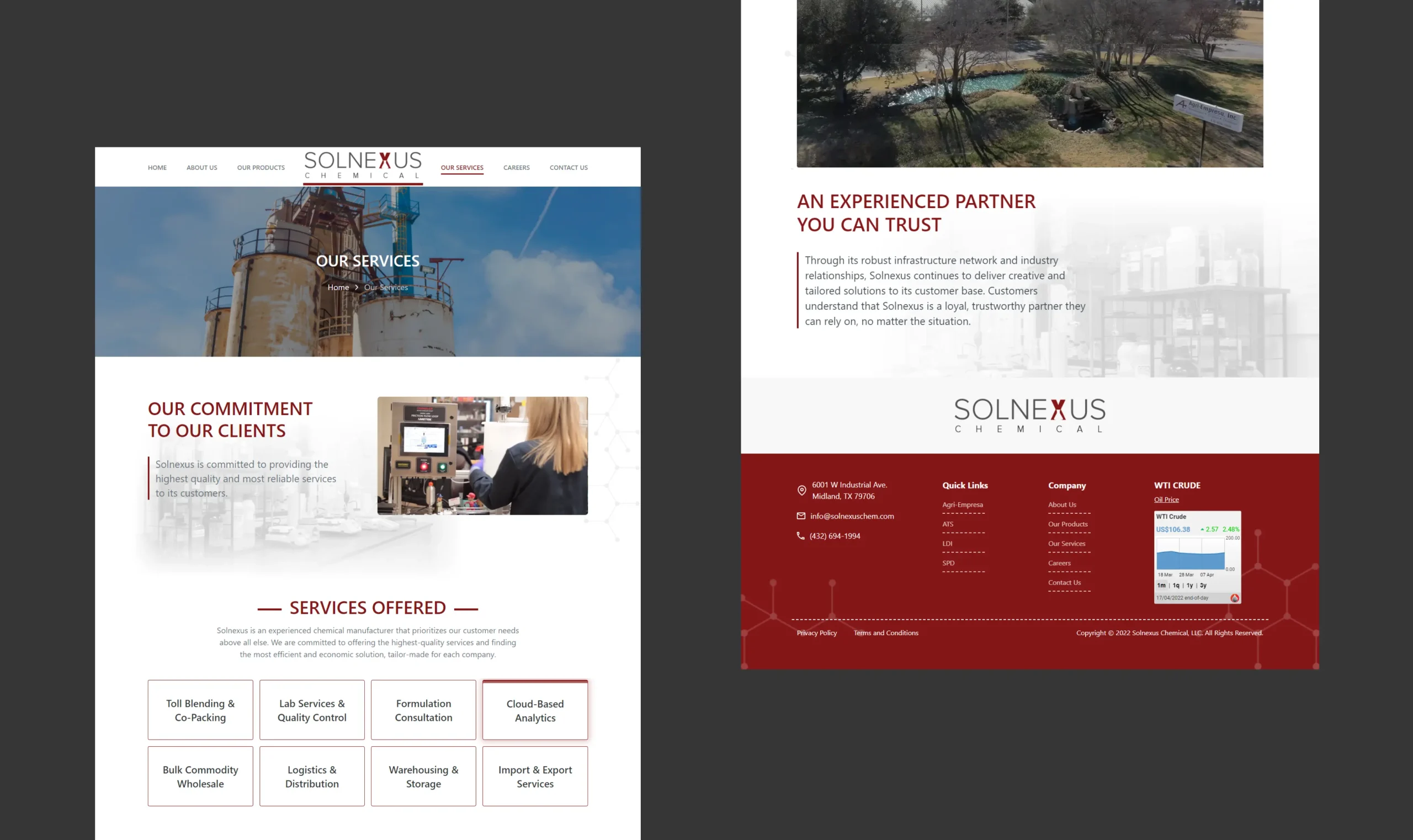
  • To incorporate multi-level lists of products into a format that users can quickly navigate.
  • To create a framework upon which not only additional pages can be built for this site, but one whose design may be used on sites of Solnexus’ sister companies.

RESEARCH & PLANNING

In order to understand Solnexus' needs, we began with a thorough review of their existing site, their competition, their data analytics, and their goals. Solnexus did not anticipate utilizing the site for eCommerce, nor did they need a blog. They needed a way to be found by the search engines and customers alike, while remaining fairly spartan in design. Some of Fahrenheit’s greatest work came in developing unique animations on the site to add value to pages without overwhelming them and through embedding video to play in a large format, and on mobile, without sacrificing load speed. From a development standpoint, these were two features no competitors could boast.

DESIGNING SOLUTIONS

One challenge we faced was creating a visually unique site based on the imagery that is ubiquitous in West Texas. Every town has a railroad, silos, and wind-swept plains, so creating the right saturation and hues were important to bring beige to bold.

Through multiple iterations with the client, Fahrenheit was able to package numerous chemical products into a sortable list within product families allowing users to quickly find the products or chemicals that they needed.

Scroll Here
Portfolio Page Portfolio Page

The outcome

Solnexuschemical.com is a simple site, done well. With the user constantly in mind, Fahrenheit was able to design a quick yet feature-rich website that will serve Solnexus for years to come. With a layout designed for adding additional service and product-specific pages, this site will allow Solnexus to create content their customers need to know about and establish them as a trusted resource for processing chemicals in their area.

OUR METHOD FOR ACHIEVING THESE RESULTS

Solnexus wanted a large format video that played automatically on mobile devices and desktop. To do so, Fahrenheit used custom embedding code to achieve their results. To flavor the page further, we designed the 3D animation of a chemical compound to build before the user's eyes without slowing down the page performance. Design that starts with end-user in mind is destined for success.

95%
95
PERFORMANCE
93%
93
ACCESSIBILITY
100%
100
SEO RATING

COME WORK WITH US

Like what you see?
Contact us to discuss your project. We’re ready to help.

Contact Us

This field is for validation purposes and should be left unchanged.