Picking and using your brand colors shouldn’t be a game of “what’s my favorite color?” Instead, it should involve a little brand soul searching. Matching your brand mission, goals, and values to color choice and usage are essential to effective brand communication. The use of color in branding helps convey emotions and creates visual consistency and hierarchy which, in turn, builds brand recognition.
When you establish your brand colors, you’re also establishing how people will view your brand. Each color should enforce the meaning and purpose you are trying to convey to consumers. What do you want your consumers to feel and associate with your brand? Do you want them to know you’re trustworthy, innovative, or maybe passionate? You should take color choice seriously so your brand can communicate effectively.
When selecting your brand color palette you must also create rules that dictate when to use each color. This will help consumers recognize which brand they’re interacting with as soon as they see the colors. Think about which brand you associate most with the color red; I can bet most of you thought of Coca-Cola or Netflix.
Establishing brand guidelines for your colors will help consumers understand your business’ hierarchy. When designing any color scheme it’s best to decide which color will be your primary, secondary, and accent color. Designating colors will help ensure that you’re not using all the colors all the time. Color hierarchy helps people navigate information. If you use each color equally, consumers won’t know which color to pay attention to.
Color Symbolism
Consciously or subconsciously, people associate colors with different feelings and meanings based on their past experiences. Color context plays a key factor in how people perceive colors. Here are some common meanings assigned to colors:
Red – Passionate, dangerous, extreme, powerful
Orange – Creative, fast, fun, spontaneous
Yellow – Bright, happiness, warmth, caution
Green – Natural, clean, energy, fresh
Blue – Trustworthy, dependable, innovative, calm
Purple – Royal, rare, luxury, authority
Color Schemes
Complementary Color Scheme
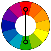
Complementary colors sit opposite of each other on the color wheel (e.g. red and green). Using complementary colors creates the most contrast because these pairs are separated the most on the color wheel. Although complements create the most contrast, they don’t always work the best in color schemes.. When using this color scheme, be careful to make sure your colors are not too harsh. Complementary colors work well when calling attention to a detail rather than using them in large quantities.
Walmart’s logo uses a light blue as their primary color to convey that they are friendly and approachable. The yellow-orange secondary color is bright and conveys innovation and happiness.

Analogous Color Scheme
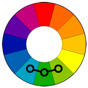
Analogous colors lie right next to each other on the color wheel. These colors usually create cohesive color schemes (e.g. dark green, light green, and yellow). This type of color scheme commonly occurs in nature which is why it creates a harmonious feeling. One thing to consider when picking analogous colors is to make sure there is enough contrast between each color.
BP’s logo does a good job of using two distinct greens which convey energy and nature. The yellow suggests light, heat, and the sun.

Split-Complementary Color Scheme
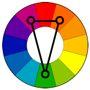
Split-complementary colors include one base color and the two colors adjacent to the complementary color (e.g. blue, red-orange, and yellow-orange). This color scheme is similar to the complementary color scheme because of its strong visual contrast, but it is not as harsh.
The Firefox logo’s red- orange and yellow fox conveys a passion for innovation.The blue signifies the world and technology it provides.

Triadic Color Scheme
Triadic color schemes work with three colors that are evenly spaced around the color wheel (e.g. purple, orange, green). This color scheme tends to be very vibrant so using it successfully can be tricky. The colors you choose should all be visually balanced, but you need to decide on a dominant color.
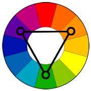
The FedEx logo is a combination of the triadic and rectangular color schemes. You might be wondering where the green comes in? I’ll discuss that in the next color scheme. Purple is a quirky color and stands out compared to the boring USPS logo. The orange conveys the sense of urgency and speed FedEx is known for. If you’ve ever wondered the history of their logo, you can read the interview with its designer.

Rectangle (Tetradic) Color Scheme
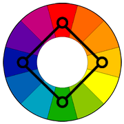
Four colors arranged into two complementary pairs (e.g. blue/orange and red/green) comprise rectangular color schemes. This color scheme lends itself to many possibilities because of all the color combinations you can create.
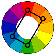
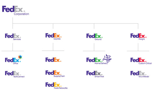
Notice FedEx used orange and green from the triadic color scheme and determined their other brand colors by incorporating the rectangle color scheme. FedEx applies this color scheme to differentiate between their services. Ground services uses green because it relates to the Earth and transport on land. Freight service uses red to convey the gravity of handling large shipments. Office services uses blue to promote trustworthiness to provide the best service for your needs.
Square Color Scheme
Like the rectangular scheme, square color schemes also have four colors. In the square color scheme, the colors are evenly spaced around the color wheel (e.g. blue, red, yellow, and green). For a successful color scheme, there must be a balance between the warm and cool colors. Depending on the colors used, square color schemes can seem primary or childlike.
Although the Google logo uses primary colors, these colors convey exactly what they are intended to stand for. The colors are friendly and encourage people return to their childlike curiosity. The colors are playful, yet refined enough, to be used sophisticatedly.

Incorporating color theory and taking color perceptions into consideration can lead to a more successful use of color for your brand. Maybe all your brand needs are some rules on when and where to use your colors to create consistency and hierarchy. Perhaps changing your call to action button to a bright orange could help with conversions because it has high contrast to its surroundings. Whatever it is, taking color into consideration can help drive brand messaging and recognition.
Fahrenheit is proudly featured as a leading Top Austin Branding Agencies by Design Rush.
